55. Create a pitch deck that investors can read in seconds, because that may be all you get
Watch the video version on YouTube
Founders are often frustrated that, after struggling for weeks to perfect their pitch deck, investors just skim through it in a few seconds. Unfortunately, because they look at so many companies, they don't have a choice. I recently attended a webinar by Eric Bahn, GP and co-founder at Hustle Fund, where he talked about using better slide headlines to create a skimmable deck. His approach resonated with me, but I also had some additional thoughts on the topic. So, with his permission, I wrote this article to comment on and expand upon his concept.
Eric's presentation started by describing a typical VC. Because they often have backgrounds as analysts or in finance, they learn to read and write slide decks that you can understand with just a glance. In my experience, angel investors tend to be operators and are somewhat more willing to read the pitch deck. But, they are still likely to skim first to determine if a more detailed read will be worth their while.
Eric suggests that the slide headlines should contain most of the vital information in the presentation. The contents of the slides only serve to support and amplify the titles. He advocates making the headlines complete sentences so that they can stand on their own. Furthermore, when read in order, they should create a comprehensible paragraph explaining the key aspects of the company and opportunity.
I have not seen this particular suggestion before, but it certainly addresses something that always bothers me. Slide titles like "Problem" or "Traction" don't convey any useful information and are redundant if the content is clear.
I immediately thought back to my grandfather's advice about slide shows (the old-fashioned kind). He told me that when you show a vacation photo of you standing in front of the Eiffel Tower, don't say, "this is me in front of the Eiffel Tower." We can see that! Instead, say something about the situation, your experience, or any other information that is not immediately apparent to your audience. For example, you might say, "This is a marvel of engineering. Its use of iron was so efficient that, if you melted it down, the puddle at its base would only be two and a half inches deep!"
Similarly, if you are talking about how some people are losing money because of process inefficiencies, I know this is the "Problem." You don't need to say that at the top of the page.
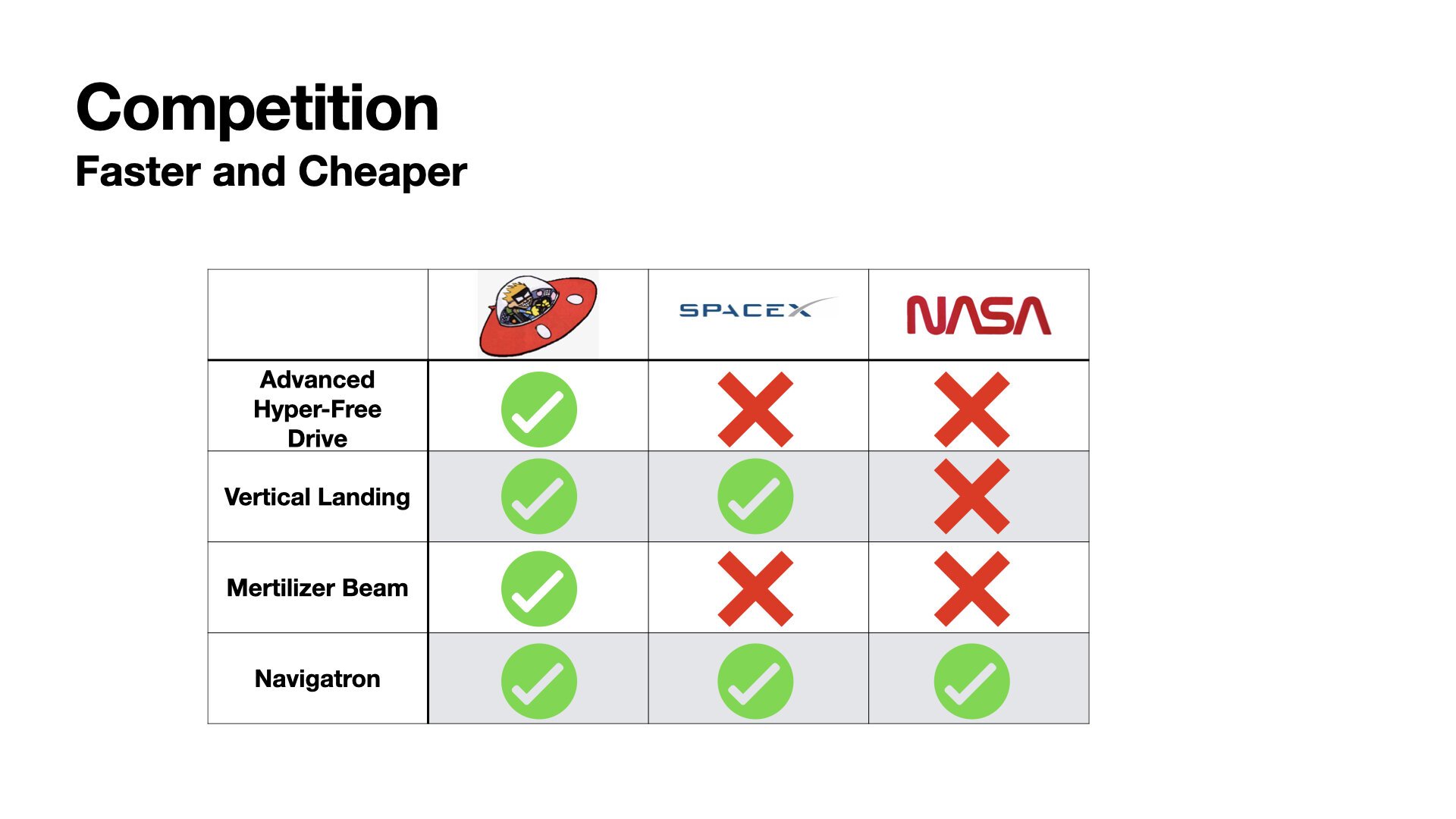
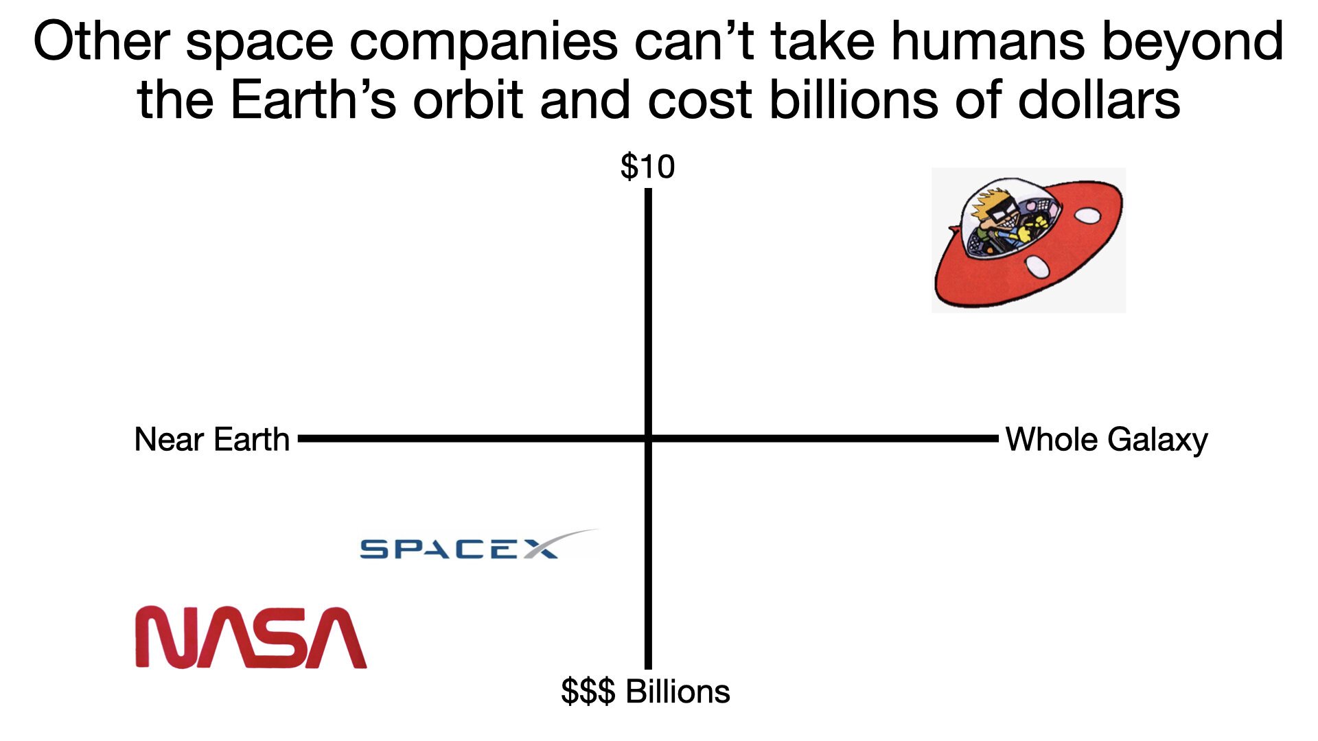
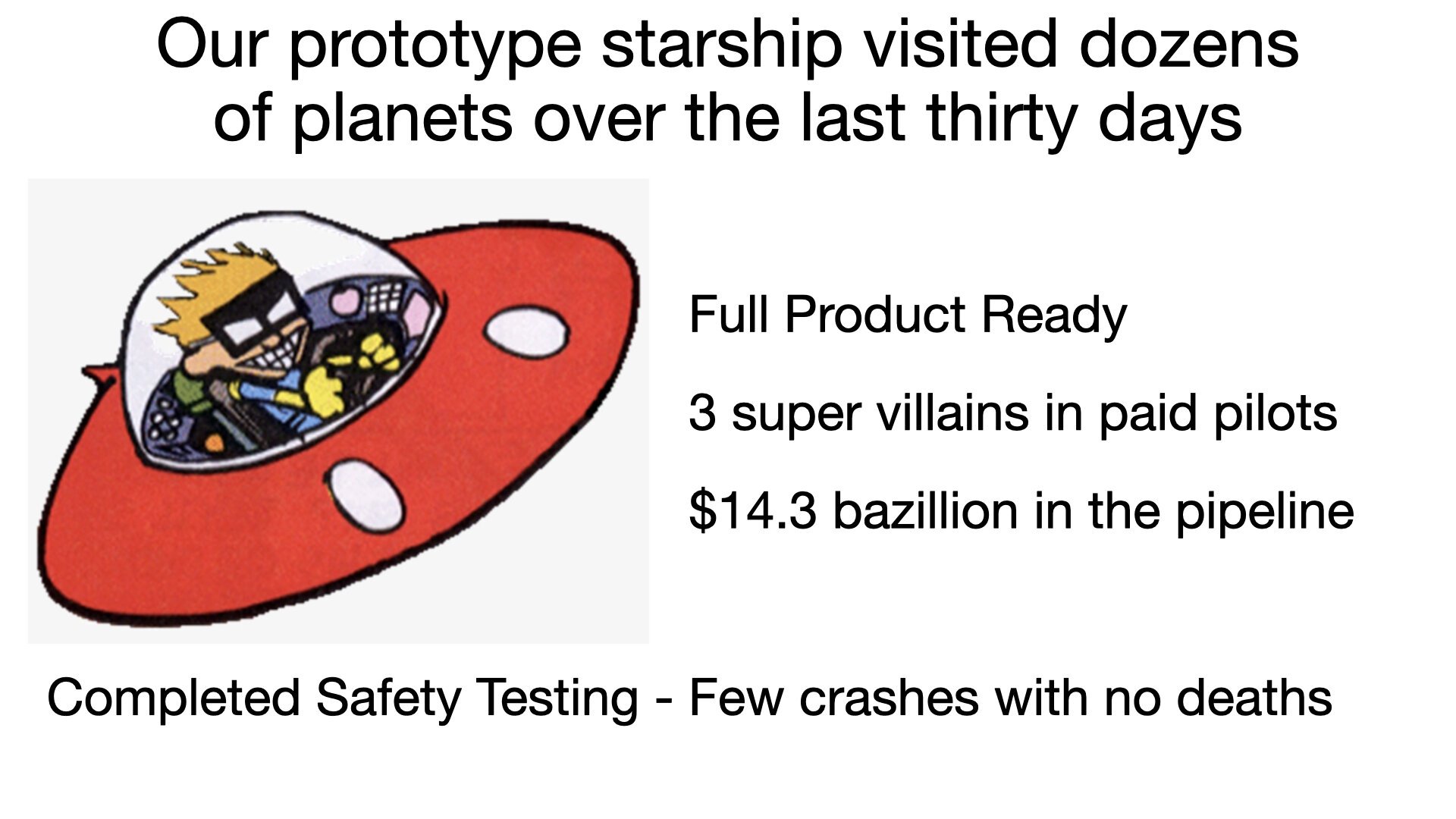
To make this more explicit, I created some example decks using my favorite example, Spaceman Spiff from Calvin and Hobbs. Spiff is fundraising for his startup company making rockets powered by his fantastic new "Freem Drive." If you are not familiar with Spaceman Spiff, I can't resist sharing this link to the first comic in which it appeared: https://www.gocomics.com/calvinandhobbes/1985/12/15
In the conventional approach, each of the slides gets titled with its purpose: Problem, Solution, Market, Competition, Traction, and Team. The slides often use sentence fragments and bullets to convey their points. Unfortunately, the result is not something you can quickly skim. A reader would need to slow down and look at the contents of each slide to understand the point they are making.
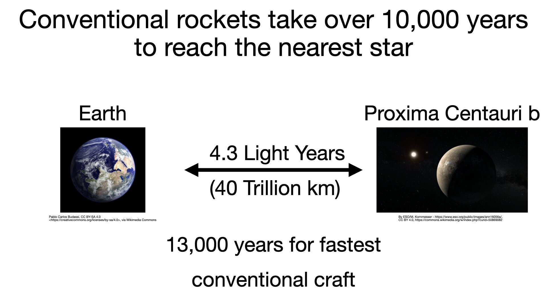
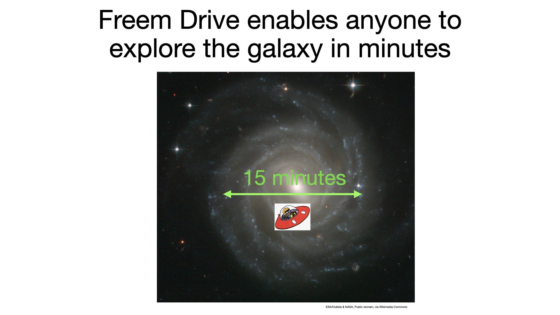
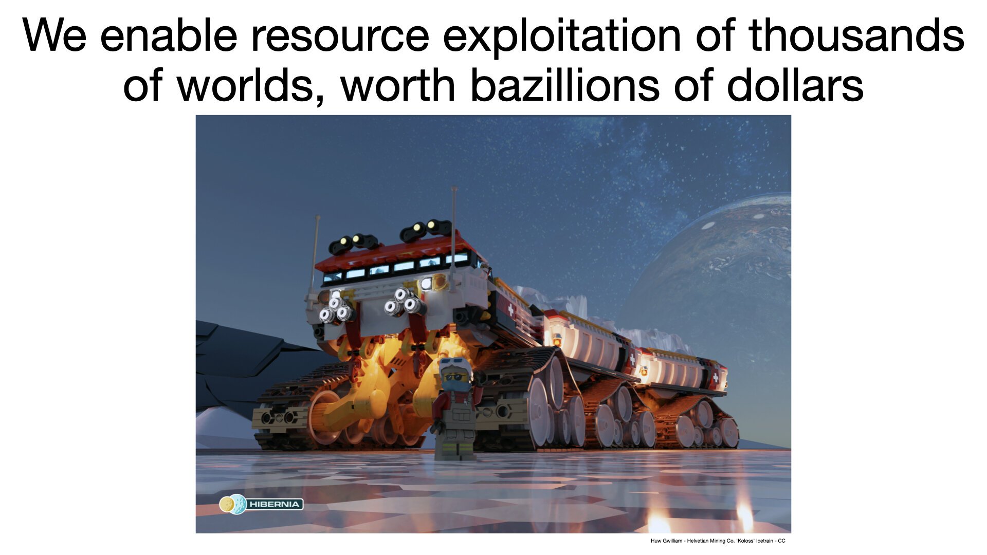
When I replace the slide titles with informative sentences, the presentation jumps out at the reader. Each headline makes the key point of the slide while the contents elaborate on or support that message.
When you read the headlines together, they make sense.
"Conventional rockets take over 10,000 years to reach the nearest star. Our Freem Drive enables anyone to explore the galaxy in minutes. We enable resource exploitation of thousands of worlds, worth bazillions of dollars. Other space companies can't take humans beyond the Earth's orbit and cost billions of dollars. Our prototype starship has traveled thousands of light-years and visited dozens of planets over the last thirty days. Only our founder Spaceman Spiff, the world's foremost Freem Drive engineer and famous cosmic adventurer, can deliver on this vision."
This approach also has the advantage of helping you organize your slides. For readers to follow your message, presentations must flow logically and smoothly from topic to topic. Using complete sentences as headlines makes it obvious when your deck has a problem. Logical progression failures often happen when a deck goes through many rounds of revisions. A slide that made sense in its original position now does not follow from the previous ones. Reading through the headlines can quickly show you where you need to make changes.
I encourage you to check out Eric's webinar here: https://youtu.be/z7icuhqPq5s In addition to the presentation, he has extensive Q&A with the audience that helps explain the concept in more detail.


